.svg)
How Thoughtful Postcard Design Drives Attention and Response


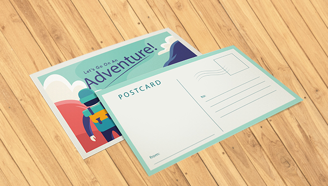
Even in a digital-first environment, postcards remain one of the most effective ways to capture attention. Their physical presence, immediate visibility, and simplicity make them difficult to ignore. When designed well, a postcard delivers a clear message in seconds, prompting recipients to take action, whether that means visiting a website, responding to a notice, or engaging with a brand. As a communication medium, postcards continue to offer a unique combination of reach, speed, and impact.
At RelayDocs, we help organizations modernize how physical communications are designed, delivered, and tracked. By combining intelligent workflows, address accuracy, and automated delivery, we ensure every postcard reaches the right audience at the right time. In this blog, we explore practical design principles and proven strategies that help postcards stand out, communicate clearly, and drive meaningful engagement.
How Design Shapes Direct Mail Performance
Design is one of the most important factors in whether a postcard captures attention or gets overlooked. In an environment where people are constantly filtering messages, direct mail has only a brief window to make an impression. Strong design helps a postcard stand out immediately, communicate its purpose clearly, and motivate the recipient to take the next step.
When visual clarity and messaging work together, a postcard becomes more than a piece of mail, it becomes a prompt for action.
First Impressions Establish Credibility
The moment a recipient sees a postcard, its design sets expectations. A polished layout, consistent branding, and thoughtful use of space signal professionalism and reliability. Mail that looks intentional and well-crafted builds confidence, while cluttered or generic designs are often dismissed without a second glance.
For organizations sending important communications, visual credibility reinforces the message that the content inside matters.
Structure and Simplicity Improve Understanding
Effective design makes information easy to absorb at a glance. Clear hierarchy, concise copy, and purposeful visuals guide the reader through the message without effort. When content is well-organized, recipients can quickly understand what the postcard is about and what action is expected.
This clarity increases the likelihood that recipients will follow through, whether that means scanning a QR code, visiting a website, or responding to a notice.
Visual Elements Influence Engagement
Color, imagery, and typography do more than decorate a postcard, they shape perception and response. Muted tones can convey stability and trust, while bolder colors can signal urgency or draw attention to key actions. Typography choices affect readability and tone, helping reinforce the message being delivered.
When visual elements align with the purpose of the communication and the audience’s expectations, postcards become more memorable and more effective.
Know Who You Are Designing For
Effective postcard design starts with a clear understanding of the recipient. Without audience insight, even the best creative can miss its purpose. Every design choice, from imagery and color to layout and language - should be shaped by who the message is intended for and what matters to them.
Let Data Guide Your Audience Strategy
Audience clarity comes from data, not assumptions. Use available insights to define who you are reaching and how they are most likely to respond. Key considerations include:
- Demographics such as age, location, and household profile
- Past engagement or purchase behavior
- Interests, priorities, and decision drivers
This information helps ensure your postcard is relevant, timely, and aligned with recipient expectations.
Design with the Recipient in Mind
Once the audience is defined, tailor the design to reflect their preferences and context. Different audiences respond to different visual cues:
- Classic or heritage-inspired layouts can appeal to audiences drawn to tradition or craftsmanship
- Clean, modern designs with strong typography often resonate with financial, healthcare, or technology recipients
- Community-focused visuals and language are effective for nonprofits and mission-driven communications
Design that feels familiar and intentional increases credibility and response.
Match the Message to What Matters
Visuals alone are not enough. The message itself must align with the recipient’s priorities. Use language that feels relevant, empathetic, and purposeful. When tone, offer, and imagery reflect what the audience values, the communication feels personal rather than promotional, and is more likely to drive action.
Design Fundamentals That Drive Results
A postcard may be brief, but its impact depends on precision. Strong design captures attention quickly, delivers clarity, and removes friction from the response process. Every element should earn its place.
Lead with a Clear, Compelling Headline
The headline sets the tone and determines whether the postcard is read or set aside. Keep it concise, benefit-focused, and easy to understand at a glance. Position it prominently so the value is immediately clear.
Use Visuals with Purpose
Imagery should reinforce the message and support brand recognition. High-quality visuals create consistency and trust. Effective postcards typically include:
- A discreet but recognizable brand mark
- A cohesive color system aligned with your brand
- Imagery that directly relates to the service, offer, or message
Avoid clutter. Visual clarity improves recall.
Personalize Where It Matters
Personalization increases relevance and response. Variable data printing allows postcards to speak directly to the recipient by incorporating details such as:
- The recipient’s name or location
- Contextual references tied to geography or timing
- Personalized URLs or QR codes for tracking and engagement
When mail feels tailored, it feels intentional.
Make the Next Step Obvious
A postcard should never leave the recipient wondering what to do next. The call to action should be clear, direct, and visually distinct. Reinforce it in more than one place when appropriate, using straightforward language that encourages immediate response.
Keep the Layout Focused and Readable
A clean layout helps the message flow naturally. Use familiar reading patterns, maintain ample white space, and choose fonts that are easy to scan. Well-structured design reduces cognitive effort and increases the likelihood that recipients will act.
Design Techniques That Make Mail Impossible to Ignore
In an inbox-first world, physical mail stands out because it can be seen, touched, and remembered. But attention in the mailbox is not automatic. It is earned through thoughtful design that delivers clarity, relevance, and impact at a glance.
Use Color to Stop the Scroll of the Mailbox
High-contrast color combinations naturally draw the eye and highlight key messages. Bold palettes can signal urgency, trust, or calm depending on your audience and use case. The key is consistency. Colors should reinforce your brand while making the message instantly legible.
Choose Formats That Demand Attention
Standard postcard sizes work well for simple messages, but larger or non-traditional formats create immediate visual separation. Oversized cards, rounded corners, or folded layouts give your message more presence without sacrificing deliverability.
Add Tactile Elements That Feel Intentional
Texture creates memory. Finishes like embossing, premium stock, or subtle foil accents encourage recipients to hold onto the piece longer. Physical detail adds perceived value and reinforces credibility.
Bridge Print and Digital Engagement
QR codes and personalized URLs connect physical mail to digital experiences. Whether it is directing recipients to a secure portal, booking page, or personalized landing page, this hybrid approach increases response while enabling measurable tracking.
Lead With Benefits, Not Features
Design gets attention. Messaging drives action. Focus on what the recipient gains, not what your organization offers. Clear, benefit-driven language paired with authentic imagery creates emotional connection and trust.
Design With Postal Compliance in Mind
Effective design works within postal guidelines. Leaving proper space for addresses, barcodes, and postage ensures smooth processing and avoids delays. Early compliance checks reduce reprints and protect campaign timelines.
Avoid Common Design Pitfalls
- Overcrowded layouts that overwhelm the reader
- Low-quality imagery or paper that diminishes trust
- Missing or unclear calls to action
- One-size-fits-all messaging without personalization
Simplicity and relevance outperform complexity every time.
How RelayDocs Makes Postcard Design Perform
RelayDocs helps organizations transform approved PDFs into compliant, trackable mail at scale. Our platform supports personalization, address validation, postal optimization, and real-time visibility so every postcard is delivered accurately and on time.
From transactional notices to customer communications, we help ensure your mail is not just sent - but seen, trusted, and acted on.
Ready to make mail work harder?
Explore how RelayDocs turns design into delivery.

Stay Ahead with Timely Industry Intelligence
Stay informed with expert perspectives on compliance, breach response, and secure document delivery.


Compliant Communications for Every Sector
From regulated industries like finance and healthcare to public sector entities and insurance providers, RelayDocs delivers secure, traceable, and cost-effective document automation that meets your compliance and operational needs.


Ready to Transform Your Document Workflows?
From generation to delivery, our APIs power document workflows that are secure, scalable, and fully in your control.


